


Hey there👋🏻,
In this article, you'll learn how to create a web application that generates various tints and shades of colours using React, ChakraUI, and Values.js.
Users will provide the hex code of any colour then the app generates various tints and shades of the colour.
Adding Chakra UI to a React app
Chakra UI is a library that allows you to build stunning and modern web applications using various UI components. It differs from other UI frameworks because it offers accessibility and dark mode support by default. Follow the steps below to Chakra UI to a React app.
Create a new React.js project by running the code below.
npx create-react-app colour-generator
Install Chakra UI and React Router - a JavaScript library that enables us to navigate between the pages of a React app.
npm i @chakra-ui/react @emotion/react @emotion/styled framer-motion react-router-dom
The other packages are Chakra UI dependencies.
Delete the redundant files, such as the logo and the test files from the React app, and update the App.js file to display “Hello World” as done below.
function App() {
    return (
        <div>
            <p>Hello World!</p>
        </div>
    );
}
export default App;
Update the index.css file to contain the code snippet below. It enables us to use the custom Google font.
@import url("https://fonts.googleapis.com/css2?family=Space+Grotesk:wght@300;400;500;600;700&display=swap");
* {
    margin: 0;
    box-sizing: border-box;
    padding: 0;
    font-family: "Space Grotesk", sans-serif;
}
Configure React Router and Chakra UI by copying the code below into the index.js file.
import React from "react";
import ReactDOM from "react-dom/client";
import { ChakraProvider, extendTheme } from "@chakra-ui/react";
import { BrowserRouter } from "react-router-dom";
import App from "./App";
import "./index.css";

const root = ReactDOM.createRoot(document.getElementById("root"));
root.render(
    <React.StrictMode>
        <ChakraProvider
            theme={extendTheme({
                fonts: {
                    body: "Space Grotesk",
                    heading: "Space Grotesk",
                },
            })}
        >
            <BrowserRouter>
                <App />
            </BrowserRouter>
        </ChakraProvider>
    </React.StrictMode>
);
The code snippet above wraps the entire application with the ChakraProvider component, which provides access to all the UI components Chakra UI provides. The ChakraProvider also enables us to change the font type of its component via the extendTheme function.
Congratulations!🎉 You have successfully configured Chakra UI and now have access to all its components.
Building the application user interface
Here, I'll walk you through building the entire user interface for the application with Chakra UI.
The application is divided into two pages - the Home.js component and the Colours.js component. Create a components folder containing both files.
mkdir components
cd components
touch Home.js Colours.js
Before we start designing each component, update the App.js file to render each component on its specific route as done below:
import React from "react";
import { Route, Routes } from "react-router-dom";
import Home from "./components/Home";
import Colours from "./components/Colours";

const App = () => {
    return (
        <div style={{ backgroundColor: "#F1F6F9" }}>
            <Routes>
                <Route path='/' element={<Home />} />
                <Route path='/colour/:id' element={<Colours />} />
            </Routes>
        </div>
    );
};

export default App;
The Home component
Copy the code below into the Home.js file.
import {
    Box,
    Button,
    Flex,
    FormControl,
    Heading,
    Icon,
    Input,
    Text,
    Alert,
    AlertTitle,
    AlertIcon,
} from "@chakra-ui/react";
import React, { useState } from "react";
import { FaGithub, FaTwitter } from "react-icons/fa";
import { useNavigate } from "react-router-dom";

const Home = () => {
    let [colour, setColour] = useState("");
    const [alert, setAlert] = useState(false);
    const navigate = useNavigate();

    const redirectPage = (e) => {
        e.preventDefault();
        if (colour.startsWith("#") && colour.length >= 4) {
            //👇🏻 removes the # sign before redirecting the user
            colour = colour.substring(1);
            return navigate(`/colour/${colour}`);
        } else {
            setAlert(true);
        }
    };
    return (
        <Box>
            <Flex
                w='full'
                h='10vh'
                p={{ base: "10px 30px", md: "10px 40px" }}
                alignItems='center'
                justifyContent='space-between'
                borderBottom='1px'
                borderBottomColor='gray.200'
            >
                <Text fontSize='26px' color='gray.600' fontWeight='bold'>
                    TintTastic
                </Text>
                <Flex alignItems='center'>
                    <a
                        href='https://github.com/dha-stix/tints-shade-generator'
                        target='_blank'
                        rel='noreferrer'
                    >
                        <Icon
                            as={FaGithub}
                            boxSize={6}
                            color='#9BA4B5'
                            cursor='pointer'
                            _hover={{ color: "#212A3E" }}
                            mr='50px'
                        />
                    </a>
                    <a
                        href='https://twitter.com/dayvid_JS'
                        target='_blank'
                        rel='noreferrer'
                    >
                        <Icon
                            as={FaTwitter}
                            boxSize={6}
                            color='#9BA4B5'
                            cursor='pointer'
                            _hover={{ color: "#212A3E" }}
                        />
                    </a>
                </Flex>
            </Flex>
            <Flex
                alignItems='center'
                justifyContent='center'
                minH='90vh'
                p={{ base: "30px", md: "30px 80px" }}
                flexDirection='column'
            >
                <Heading
                    as='h1'
                    size='3xl'
                    textAlign={{ base: "left", md: "center" }}
                    fontWeight='900'
                    mb='30px'
                >
                    <span
                        style={{
                            color: "#F97B22",
                        }}
                    >
                        Effortlessly
                    </span>{" "}
                    create beautiful color palettes for your projects
                </Heading>
                <Heading
                    as='h4'
                    size='md'
                    fontWeight='normal'
                    textAlign={{ base: "left", md: "center" }}
                    mb='30px'
                >
                    TintTastic is a user-friendly tint and shade generator that will
                    elevate your color game in no time.
                </Heading>

                <FormControl
                    as='form'
                    display='flex'
                    alignItems={{ base: "left", md: "center" }}
                    justifyContent='center'
                    flexDirection={{ base: "column", md: "row" }}
                    onSubmit={redirectPage}
                >
                    <Input
                        placeholder='#ffffff'
                        type='text'
                        name='color'
                        id='color'
                        w={{ base: "full", md: "50%" }}
                        mr='30px'
                        required
                        mb={{ base: "15px", md: "0px" }}
                        value={colour}
                        onChange={(e) => setColour(e.target.value)}
                    />
                    <Button
                        w={{ lg: "25%" }}
                        colorScheme='orange'
                        size='lg'
                        type='submit'
                    >
                        Generate Shades
                    </Button>
                </FormControl>
                {alert && (
                    <Alert
                        status='error'
                        w={{ base: "full", lg: "50%" }}
                        mt='30px'
                        borderRadius='5px'
                    >
                        <AlertIcon />
                        <AlertTitle>Only accepts hex code values!</AlertTitle>
                    </Alert>
                )}
            </Flex>
        </Box>
    );
};

export default Home;
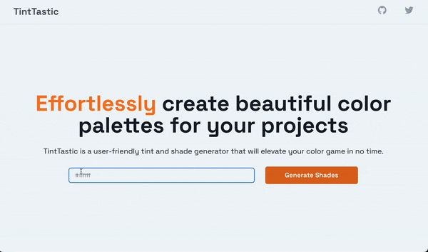
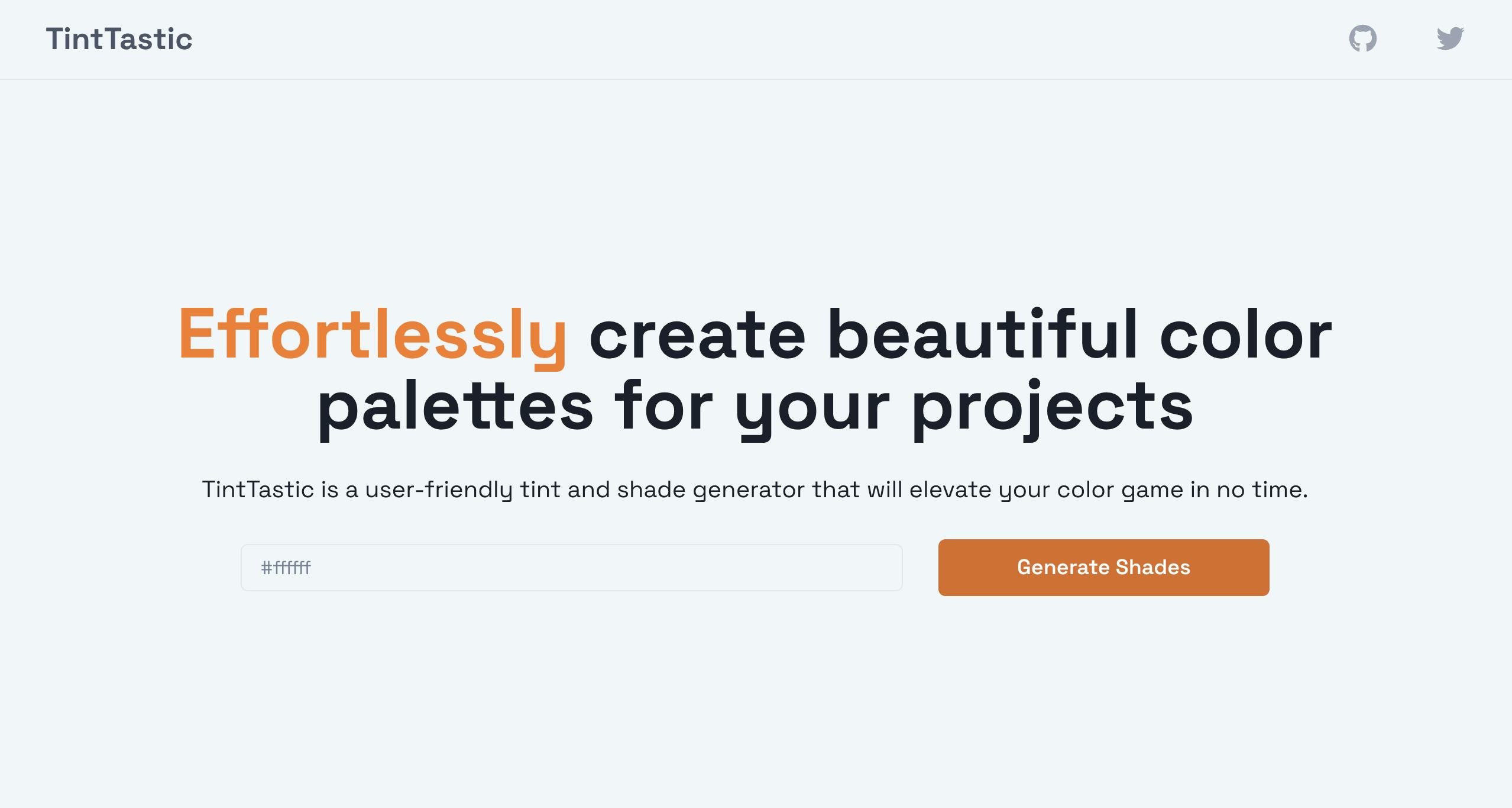
The code snippet above displays a fully responsive home page using various Chakra UI components and allows us to enter the hex code of the colour we need to generate its tints and shades.
The redirectPage function validates the user's input and redirects the user to the Colour page. If the user's input is invalid, it sets the alert state to true. The alert state displays an error alert when its value is "true".
Generating tints and shades of a colour with Values.js
Here, you'll learn how to generate the tints and shades of various colours using the Values.js package.
Values.js is an open-source package that enables us to generate the tints and shades of any colour.
Install the Values.js package by running the code below.
npm install values.js
Recall that the Colours.js component is a dynamic route that accepts the colour code provided by the user as a parameter (id).
<Route path='/colour/:id' element={<Colours />} />
Next, pass the colour code into the Values.js package and request its tints and shades.
import React, { useEffect, useState } from "react";
import { Box, Flex, Heading } from "@chakra-ui/react";
import ColourShades from "./ColourShades";
import { Link, useParams } from "react-router-dom";
import Values from "values.js";
const Colours = () => {
const { id } = useParams();
const [shades, setShades] = useState([]);
const [error, setError] = useState(false);
useEffect(() => {
function fetchShades() {
try {
let shades = new Values(`#${id}`).all(10);
setShades(shades);
} catch (err) {
setError(true);
}
}
fetchShades();
}, [id]);
return (
<Box w='full' minH='100vh'>
<Flex
h='10vh'
w='full'
position='sticky'
top='0'
alignItems='center'
justifyContent='center'
bg={!error && shades.length > 0 ? `#${shades[10].hex}` : "#ffffff"}
borderBottom='1px'
borderBottomColor='gray.200'
>
<Link to='/'>
<Heading as='h3' size='md' color='gray.600'>
#{id}
</Heading>
</Link>
</Flex>
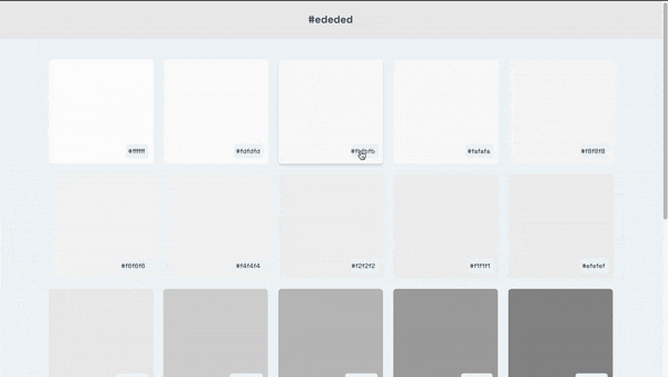
<ColourShades shades={shades} error={error} />
</Box>
);
};
export default Colours;
From the code snippet above,
The
useEffecthook passes the colour code into theValues.jspackage to generate ten tints and shades of the colour.The
shadesarray saves the colour tints and shades, and theerrorstate is set to "true" when there is an error.The
ColourShadescomponent accepts the shades and error states as props.
Create the ColourShades component and copy the code below into the component.
import { Flex, Heading } from "@chakra-ui/react";
import React from "react";
import ShadesComponent from "./ShadesComponent";

const ColourShades = ({ shades, error }) => {
    return (
        <Flex
            p='30px'
            alignItems='center'
            flexWrap='wrap'
            justifyContent='center'
            minH='90vh'
        >
            {error ? (
                <Heading as='h3' color='red.500'>
                    Incorrect hex code value
                </Heading>
            ) : (
                shades.map((shade, index) => (
                    <ShadesComponent key={index} shade={shade} />
                ))
            )}
        </Flex>
    );
};

export default ColourShades;
From the code snippet above, the ColourShades component accepts both the shades and the error state. Then, render an error message if there is an error; otherwise, it maps all the colours generated into another component called ShadesComponent.
The ShadesComponent represents each colour box. Copy the code below into the ShadesComponent component.
import React, { useState } from "react";
import { Flex, Text } from "@chakra-ui/react";

const ShadesComponent = ({ shade }) => {
    const [value, setValue] = useState(`#${shade.hex}`);

    return (
        <Flex
            bg={`#${shade.hex}`}
            w='200px'
            h='200px'
            p='10px'
            m='10px'
            cursor='pointer'
            alignItems='flex-end'
            justifyContent='right'
            _hover={{ boxShadow: "md" }}
            borderRadius='md'
        >
            <Text bg='#F1F6F9' p='5px' borderRadius='5px' fontSize='xs'>
                {value}
            </Text>
        </Flex>
    );
};

export default ShadesComponent;
How to copy the colour codes on button click
To complete this application, we need to add a final feature that allows us to copy the colour code on button click.
The React Copy-to-clipboard is a simple JavaScript package that allows us to copy and paste contents via a button click.
Install the React Copy-to-clipboard library by running the code below.
npm install --save react-copy-to-clipboard
Import the CopyToClipboard component from its library.
import CopyToClipboard from "react-copy-to-clipboard";
Wrap the entire ShadesComponent with the CopyToClipboard component.
return (
    <CopyToClipboard onCopy={onCopy} text={`#${shade.hex}`}>
        {/*-- other UI elements--*/}
    </CopyToClipboard>
);
Create the onCopy function. It changes the colour's name to "copied" to notify the user and sets it back.
const onCopy = () => {
    let value = shade.hex;
    setValue("Copied");
    setTimeout(() => {
        setValue(`#${value}`);
    }, 1000);
};
Congratulations!🎉 You've completed the project for this tutorial.
Wrap-up
So far, you've learnt,
what Chakra UI is and how to add Chakra UI to a React project,
how to generate tints and shades of colours using Values.js, and
how to copy contents on button click in React.
Here is a live demo of the application: https://tints-shade-generator.vercel.app
The source code for this tutorial is available here. Feel free to star, fork, and contribute to the project.
Did you enjoy this article or need an experienced Technical Writer for a remote, full-time, or contract-based role? Feel free to contact me.
GitHub LinkedIn Twitter